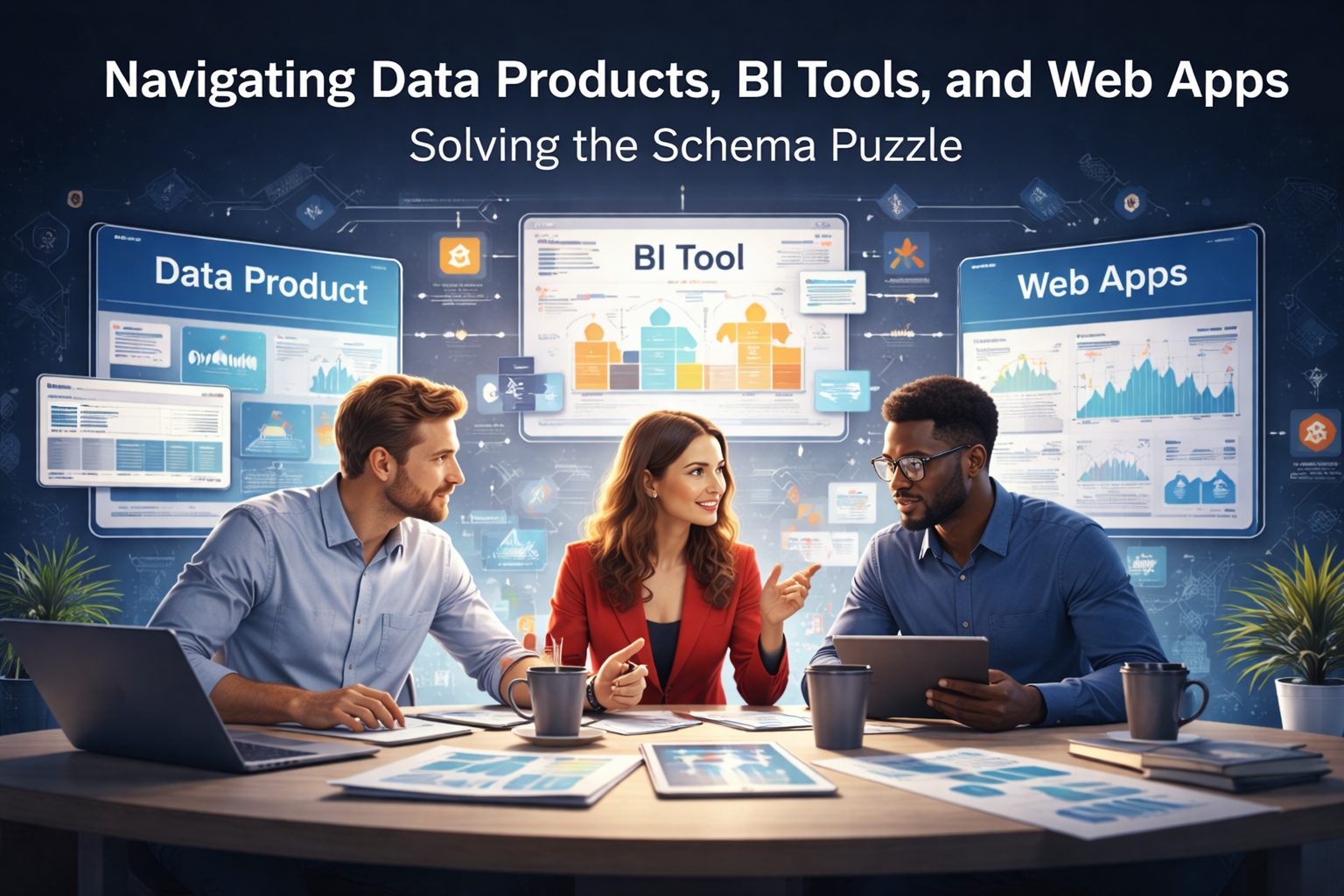
Most manufacturing companies don't have a data problem. They have a communication problem disguised as a data problem.
The data exists. It's in the ERP. It's in the MES. It's in the quality inspection logs, the maintenance tickets, the warehouse management system, and dozens of spreadsheets emailed between shifts. The problem is that none of it flows in a way that matches how the factory actually makes decisions.
I learned this firsthand during my time at an automotive company, working as a process improvement specialist in the rotational programme. Every day, I participated in a tiered meeting structure that ran from the shop floor all the way up to the regional operations VP. It was elegant in its simplicity: data flows up, decisions flow down, and nothing gets stuck in a silo. The structure was rooted in Lean Six Sigma principles, where standardised daily management and visual controls keep the operation focused on what matters.
That experience shaped my entire philosophy on how data analytics should be deployed in manufacturing. Not as a technology project bolted onto existing processes, but as a system that mirrors and empowers the way factories already communicate.
This article is a practical guide to doing exactly that.
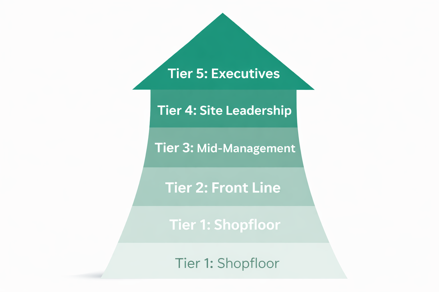
The Tier Meeting Structure: How Factories Actually Communicate
Before we talk about dashboards, data warehouses, or any technology, we need to understand the operating rhythm of a well-run manufacturing plant. The tiered daily management system (sometimes called the escalation framework or daily accountability process) is the backbone of operational communication in lean manufacturing environments.
Here's how it worked and how it works in most well-managed plants:
Tier 1 - Shift Handover (Operators + Shift Team Leader)
At the end of every shift, the outgoing team meets briefly with the incoming team. They discuss what happened during the previous shift: what ran well, what broke down, which orders were completed, where quality issues appeared, and what the next shift needs to prioritise. The audience is small: operators and their module shift team leader. The data is granular, immediate, and operational.
What data matters here: Machine status, units produced vs target, scrap counts, downtime events, safety incidents, material shortages flagged during the shift.
Tier 2 - Cross-Functional Technicians (Maintenance + Warehouse + Quality + Shift Leader)
This meeting brings together the technical backbone of the plant. Maintenance technicians, warehouse technicians, quality inspection supervisors, and the shift team leader compare notes. Did a machine breakdown on the shop floor cause a delivery delay from the warehouse? Is a quality issue on Line 3 related to a batch of raw material that arrived yesterday?
What data matters here: Open maintenance work orders, warehouse stock accuracy, quality non-conformances, inspection results, pending material movements, equipment availability.
Tier 3 - Department Reviews (All Engineers + Department Director)
Now we move from shift-level to department-level. In quality, all technicians and quality engineers meet with the quality director. In supply chain, planners and warehouse engineers review together. In maintenance, the full team aligns on priorities. This is where patterns emerge: a recurring defect across multiple shifts, a supplier consistently delivering late, a machine that keeps failing in the same way.
What data matters here: Weekly trend analysis, Pareto of defects, supplier on-time delivery rates, OEE trends by line, material consumption vs plan, open corrective actions (CAPAs), predictive maintenance indicators.
Tier 4 - Plant Leadership (All Department Directors + Plant Director)
This level brings all department directors together with the plant director. The conversation here is strategic: Are we on track to hit monthly targets? Which cross-departmental issues need executive intervention? Where are we investing, and where are we cutting? This is where the data from every tier below converges into a single operational picture.
In plants with mature planning processes, Tier 4 also intersects with the SIOP (Sales, Inventory & Operations Planning) cycle. SIOP is a monthly cross-functional process that reconciles demand forecasts with production capacity, inventory policy, and financial targets. The Tier 4 meeting reviews SIOP outputs to ensure the plant's operational reality aligns with the demand plan and financial commitments.
What data matters here: Plant-level OEE, scrap rate trends, cost per unit, delivery performance (OTIF), inventory turnover, capital expenditure tracking, headcount and labour productivity, safety metrics, AOP variance reports, and SIOP demand vs capacity reconciliation.
Tier 5 - Regional Operations (Operations VP + Plant Managers + Functional Directors)
This is the layer most articles on manufacturing analytics never mention, but it's where the real strategic leverage lives. The Operations VP sits with all plant managers from across the region, alongside the regional HR director, supply chain director, finance director, and the global Six Sigma Black Belt expert.
The conversation at Tier 5 is no longer about a single plant. It's about the network. Which plant is outperforming and what can we learn from it? Where are we allocating capital next quarter? Is the scrap improvement programme at Plant B delivering the savings the Black Belt projected? Are we staffed correctly across the region for the demand forecast?
This is where the STRAP (Strategic Plan) and AOP (Annual Operating Plan) live. The STRAP sets the multi-year direction for the entire manufacturing network: capacity investments, market positioning, technology roadmaps, and footprint decisions. The AOP translates that strategy into the current year's financial and operational targets: revenue, cost per unit, headcount, capital expenditure, and margin goals for each plant. Every KPI at Tier 4 should trace back to an AOP target, and every AOP target should trace back to the STRAP.
Critically, AOP targets must cascade all the way down through the tiers. The regional revenue and cost targets in the AOP break down into plant-level targets at Tier 4, which break into departmental targets at Tier 3, which translate into daily and shift-level targets at Tiers 2 and 1. When this cascading works properly, every operator on the shop floor can see how their shift's output contributes directly to the organisation's annual goals. When it doesn't work, you get a phenomenon common in less mature organisations: if you add up everyone's individual target achievements, you'd reach 300% of the goal, while the organisation as a whole somehow missed it.
This is also where Lean Six Sigma methodology meets data at scale. The Black Belt isn't just running improvement projects at individual plants. They're validating that the statistical gains from those projects are showing up in the numbers across the entire operation. The finance director is reconciling operational metrics with the P&L. HR is connecting headcount, training completion, and skill matrix data to productivity outcomes.
What data matters here: Multi-plant OEE comparison, cross-plant benchmarking on scrap, cost per unit, and OTIF. Regional inventory position and inter-plant transfer efficiency. Six Sigma project portfolio with validated savings vs target. Headcount vs plan by plant. Training completion rates. Capital expenditure portfolio status vs STRAP investment plan. AOP variance by plant (revenue, cost, margin). Demand forecast accuracy by region. Working capital tied up in inventory across all sites.
The data challenge at Tier 5 is fundamentally different from Tiers 1-4. You're no longer aggregating within a single plant's data warehouse. You're aggregating across multiple plants, each potentially running different ERP instances, different MES systems, and different data definitions. This is where a well-governed, centralised data warehouse (or a federated architecture with a common semantic layer) becomes non-negotiable.
The Core Principle: Your Data Architecture Should Mirror Your Meeting Architecture
Here's where most data analytics deployments in manufacturing go wrong. The IT team or an external consultancy builds a set of dashboards (often beautiful ones) that have no relationship to how the factory actually communicates.
You end up with a Power BI report that the plant director loves but the shift team leader has never seen. Or a real-time OEE screen on the shop floor that no one looks at because it doesn't answer the questions being asked in the Tier 1 meeting.
The correct approach is to design your analytics system as a hierarchy that maps directly to the tier meeting structure. Each tier gets its own view of the data, at the right level of aggregation, answering the questions that tier actually asks.
This means:
Tier 1 dashboards are granular, shift-specific, and operational. They update in near real-time. They show what happened in the last 8 hours and what needs to happen in the next 8. They live on screens at the shop floor or on tablets carried by team leaders.
Tier 2 dashboards aggregate across shifts and cross-reference between functions. They highlight where maintenance, quality, and logistics issues intersect. They're reviewed daily.
Tier 3 dashboards show weekly and monthly trends within each department. They surface patterns, enable root cause analysis, and track corrective actions. They're the analytical layer where engineers dig deeper.
Tier 4 dashboards are the plant executive summary. Plant-level KPIs, month-to-date performance against AOP targets, SIOP plan adherence, and strategic metrics that inform investment and resource allocation decisions.
Tier 5 dashboards aggregate across multiple plants. They enable cross-site benchmarking, portfolio-level Six Sigma project tracking, AOP variance analysis by plant, and regional strategic decisions aligned with the STRAP. They're the view for the Operations VP who needs to compare performance across an entire manufacturing network and allocate resources where they'll have the most impact.
All five levels are powered by the same data architecture. At the plant level, a single data warehouse. At Tier 5, a federated layer that connects each plant's data into one regional view. Same data, different lenses. This is the single source of truth.
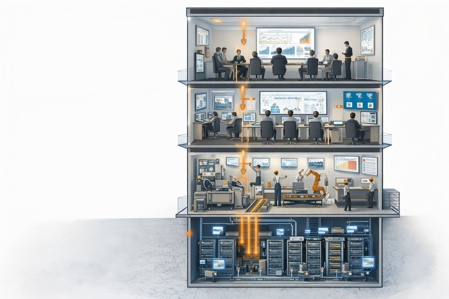
Building the Single Source of Truth: The Data Warehouse
The cross-section illustration at the top of this article tells the story visually: the data warehouse sits at the foundation, like the basement of the factory. Everything above it, every dashboard, every report, every alert, draws from this single repository.
Why a Centralised Data Warehouse Matters in Manufacturing
In a typical manufacturing plant, data lives in at least half a dozen systems that don't talk to each other:
- ERP (SAP, Oracle, Microsoft Dynamics): production orders, BOMs, procurement, financials
- MES (Manufacturing Execution System): real-time production tracking, batch records
- SCADA/PLC: machine-level sensor data, cycle times, temperatures, pressures
- QMS (Quality Management System): inspection results, non-conformances, CAPAs
- WMS (Warehouse Management System): stock levels, pick lists, goods receipts
- CMMS (Maintenance): work orders, planned maintenance schedules, spare parts inventory
- Spreadsheets: the unofficial system that fills every gap the others leave
Without a data warehouse, each tier meeting relies on whoever pulled the latest spreadsheet or whoever logged into the right system that morning. Numbers conflict. Time is wasted reconciling data instead of making decisions.
A properly built data warehouse solves this by extracting data from all these sources, transforming it into a consistent format, and loading it into a single repository. The terminology is ETL (Extract, Transform, Load) or ELT depending on the architecture. The result is the same: one place where the number is the number.
What Goes Into the Manufacturing Data Warehouse
The data warehouse for a manufacturing plant should consolidate, at minimum:
Production data: units produced, cycle times, changeover times, planned vs actual output, scrap quantities and reasons, rework volumes, OEE components (availability, performance, quality) broken down by line, shift, and product.
Quality data: inspection results (pass/fail rates), non-conformance reports, customer complaints, CAPA status, statistical process control (SPC) data, material certifications. In plants running Lean Six Sigma programmes, this also includes DMAIC project tracking, process capability indices (Cpk), and control chart outputs that feed directly into Tier 3 departmental reviews.
Maintenance data: equipment downtime logs (planned and unplanned), mean time between failures (MTBF), mean time to repair (MTTR), open work orders, spare parts consumption, predictive maintenance sensor readings.
Logistics and supply chain data: inbound delivery performance by supplier, warehouse stock accuracy, inventory levels vs safety stock, goods receipt processing times, outbound delivery OTIF (On-Time In-Full), freight costs. For plants running a SIOP process, this extends to demand forecast accuracy, production plan adherence, and inventory projections against policy targets.
Financial data: cost per unit, material cost variances, labour cost allocation, energy consumption, waste disposal costs, and AOP variance analysis (actual vs plan by cost centre).
Safety data: incident reports, near-misses, safety observations, days since last recordable incident.
Technology Choices
For most mid-sized manufacturers, the data warehouse can be built on cloud platforms like Google BigQuery, Snowflake, or Azure Synapse. For those on tighter budgets or with strong internal engineering, PostgreSQL with a well-designed schema and dbt for transformations is a perfectly viable option.
The BI layer (the dashboards) can be Power BI (if you're a Microsoft shop), Tableau, Looker (if you're on GCP), Metabase (for open-source simplicity), or Grafana (particularly strong for real-time operational displays).
The choice of tool matters less than the discipline of the architecture. A beautifully designed Tableau dashboard sitting on top of a messy, undocumented data model is worse than a plain table in Metabase sitting on top of a clean, well-governed warehouse.
Designing the Dashboard Hierarchy
Let me walk through what each tier's analytics layer should look like in practice.
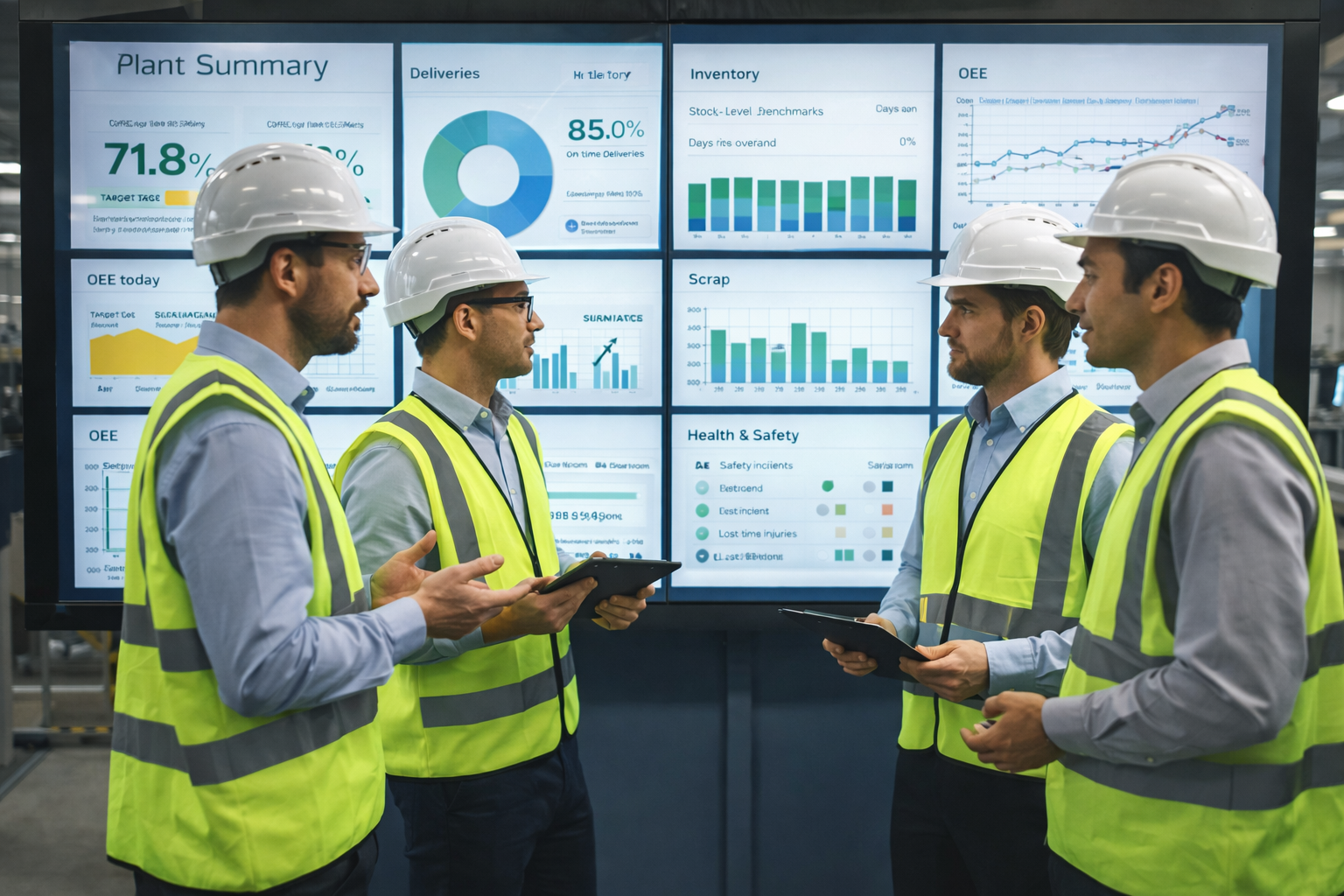
Tier 1: The Shift Dashboard
This is the most tactical layer. It should be visible on a large screen at the shop floor, ideally one per production module or cell, and also accessible on a tablet for the shift team leader walking the floor.
Refresh rate: Near real-time (every 1-5 minutes if connected to MES/SCADA, or refreshed at shift start/end from ERP data).
Key elements:
- Current shift production count vs target (big, unmissable number)
- Machine status indicators (running, idle, down, changeover), colour-coded
- Scrap count this shift, with top reason codes
- Open downtime events with elapsed time
- Safety alerts or observations logged this shift
- Next shift priority notes (entered by outgoing team leader)
The design principle is simplicity. A shift team leader glancing at this screen during a Tier 1 meeting should be able to say in under 10 seconds: "We're 12 units behind target, Line 2 has been down for 40 minutes waiting on maintenance, and we had a quality hold on batch 4417."
Tier 2: The Cross-Functional Daily View
This dashboard serves the technicians and supervisors who bridge multiple functions. It needs to make cross-references easy, connecting a maintenance event to a quality deviation to a logistics delay.
Refresh rate: Daily (updated overnight or first thing in the morning).
Key elements:
- Downtime summary by line with root cause categorisation
- Open maintenance work orders prioritised by production impact
- Quality non-conformances from the last 24 hours, linked to equipment/line
- Warehouse stock discrepancies flagged overnight
- Material availability for next 24-48 hours of planned production
- Pending quality releases blocking shipments
Tier 3: The Department Analytical View
This is where the data gets richer and more exploratory. Engineers and department managers need the ability to drill down, filter by date range, compare periods, and run Pareto analyses.
Refresh rate: Daily with ability to view weekly/monthly trends.
Key elements by department:
Quality: Defect Pareto by product, line, and shift. SPC charts for critical parameters. Supplier quality scorecards. CAPA aging report. Cost of poor quality (COPQ) trend.
Maintenance: OEE waterfall analysis. MTBF and MTTR trends by equipment class. Planned vs unplanned maintenance ratio. Spare parts inventory turns. Predictive maintenance alerts.
Supply Chain: Supplier on-time delivery trend. Inventory days on hand by material category. Warehouse accuracy rate. Production schedule adherence. Freight cost per unit trend. SIOP plan vs actual demand and production volumes.
Production: Output vs plan by line and product. Cycle time analysis. Changeover time tracking. Labour productivity (units per labour hour). Energy consumption per unit.
Tier 4: The Executive Dashboard
The plant director and department directors need a single screen that tells the story of the whole plant. This is not the place for granularity. It's the place for signals.
Refresh rate: Daily summary, with month-to-date and rolling 12-month views.
Key elements:
- Plant OEE (with availability, performance, quality breakdown)
- OTIF delivery performance
- Scrap rate (% and cost)
- Cost per unit vs AOP budget
- Inventory value and turns vs SIOP targets
- Safety metrics (recordable incidents, near-miss rate)
- Top 3 escalated issues requiring cross-departmental action
- Capital project status
- AOP variance summary (revenue, cost, margin)
Tier 5: The Regional Operations Dashboard
This is where the data architecture gets architecturally interesting. The Tier 5 dashboard doesn't serve a single plant. It serves the Operations VP who oversees all plants in a region. The data must be normalised across sites that may have different ERPs, different product mixes, and different local definitions of the same KPI.
Refresh rate: Weekly summary, with monthly deep-dives and quarterly strategic reviews aligned with the SIOP cycle and AOP review cadence.
Key elements:
- Multi-plant OEE comparison (normalised for product mix complexity)
- Cross-plant benchmarking: scrap rate, cost per unit, OTIF, labour productivity
- Regional inventory position with inter-plant transfer visibility
- Six Sigma project portfolio: active projects by plant, projected savings vs validated savings, DMAIC stage tracking
- Headcount vs plan by plant, with attrition and training completion rates
- Capital expenditure portfolio vs STRAP investment plan: approved vs spent vs remaining, ROI tracking
- AOP variance by plant (revenue, cost, margin) with drill-down to root cause
- Demand forecast accuracy by product family and region
- Working capital analysis: inventory value across all sites, days on hand by material category
- Customer complaint trends aggregated across plants serving the same customer
The Six Sigma dimension deserves special attention. The global Black Belt sitting in the Tier 5 meeting needs to see not just that Plant A's scrap went down 0.5%, but that this reduction is statistically significant (validated through control charts), that it's sustained (not a one-month blip), and that the financial savings have been confirmed by the finance director. The dashboard should surface the DMAIC stage of each project, flag projects at risk of stalling, and compare improvement velocity across plants.
This is also where HR data becomes analytically powerful. Connecting training completion rates to productivity improvements, correlating attrition spikes with quality dips, and tracking whether skill matrix gaps at a specific plant are creating a bottleneck. These cross-functional insights only emerge when the data warehouse integrates HR systems alongside operational data.
The Data Flows Up, Decisions Flow Down
The beauty of this system, and the reason the tier meeting structure has survived decades of management fads, is that it creates a natural escalation path.
A quality issue detected during Tier 1 gets escalated to Tier 2 if it involves maintenance. If the pattern persists, it surfaces in Tier 3 during the departmental review. If it requires investment or cross-departmental action, it reaches Tier 4. And if the same issue is appearing across multiple plants, or if solving it requires regional resource allocation, it reaches Tier 5, where the Operations VP and the Six Sigma Black Belt can deploy a formal improvement project with cross-plant visibility.
The data analytics system should make this escalation path visible and traceable. When the Operations VP asks in the Tier 5 meeting, "Why is Plant B's scrap 0.8% higher than Plant A when they run the same product?", the answer should be accessible by drilling from the Tier 5 multi-plant comparison into Plant B's Tier 4 executive dashboard, into the Tier 3 quality Pareto, into the Tier 2 cross-reference with maintenance events, all the way down to the Tier 1 shift log where the issue first appeared.
This drill-down capability, from regional overview to individual shift event, is only possible when all five tiers are powered by the same data architecture. Different dashboards, same truth.
This is also exactly how Lean Six Sigma projects should interact with the analytics infrastructure. When a Six Sigma Black Belt launches a DMAIC project to reduce scrap on a particular line, the Measure and Analyse phases pull directly from the data warehouse. The control charts, Pareto analyses, and process capability studies aren't built from scratch in a separate spreadsheet. They draw from the same source that powers the daily tier meetings. When the Improve phase delivers results, those results show up automatically in the Tier 3 quality dashboard and roll up into the Tier 4 plant-level scrap metric. The data warehouse closes the loop between continuous improvement projects and daily operations.
Conversely, when the Operations VP makes a strategic decision (say, reallocating production volume from an underperforming plant to a higher-performing one, or greenlighting a capital investment based on the Six Sigma Black Belt's projected savings), that decision cascades through the system. The Tier 4 plant director adjusts capacity planning. The Tier 3 supply chain dashboard updates the production schedule. The Tier 2 view shows the adjusted material requirements. The Tier 1 shift dashboard reflects the new targets for the upcoming shift.
Common Mistakes to Avoid
Having seen this implemented well and poorly across multiple manufacturing environments, here are the mistakes that derail most projects:
Building dashboards before building the data warehouse. This is by far the most common mistake. Teams rush to put pretty charts in front of leadership before the underlying data is clean, consistent, and consolidated. The result is dashboards that show different numbers depending on when you look at them, which destroys trust faster than having no dashboards at all.
Ignoring the shop floor. Many analytics deployments focus on executive reporting and neglect the people who actually make the product. If the Tier 1 shift teams don't have useful data at their fingertips, the entire system is incomplete. The shop floor is where data is born and where the most impactful decisions happen.
Over-engineering the solution. A manufacturing analytics platform does not need a data lake, a real-time streaming architecture, machine learning models, and a custom-built application on day one. Start with the basics: clean data, reliable daily refreshes, and dashboards that answer the questions each tier actually asks. You can add sophistication later.
Not assigning data ownership. Every metric needs an owner, someone who is accountable for the accuracy of that number and who can explain what it means. Without ownership, data quality degrades within weeks.
Treating it as an IT project. This is an operations project that uses technology, not a technology project that happens to serve operations. The operations team must own the requirements, the KPI definitions, and the meeting cadence. IT provides the infrastructure and technical expertise.
A Practical Deployment Roadmap
For manufacturers looking to implement this approach, here's a realistic sequence:
Month 1-2: Audit existing data sources. Map out the tier meeting structure (or establish one if it doesn't exist). Define the KPIs for each tier, linking them to AOP targets and STRAP strategic objectives. Identify data gaps. If a SIOP process exists, align the analytics roadmap with the SIOP calendar.
Month 3-4: Build the data warehouse. Start with the two or three most critical data sources (typically ERP + MES or ERP + quality system). Establish the ETL pipelines with daily refresh.
Month 5-6: Deploy the first dashboards. Start with Tier 4 (executive view) and Tier 1 (shop floor view) simultaneously. This ensures both top-down sponsorship and bottom-up adoption.
Month 7-8: Add Tier 2 and Tier 3 dashboards. Connect additional data sources. Begin iterating based on user feedback from the tier meetings.
Month 9-12: Refine, extend, and embed. Add alerting and automated reports. Introduce more advanced analytics (trend analysis, statistical process control, predictive maintenance triggers). By this point, the tier meetings should be running on the dashboards, not alongside them.
Month 12+: For multi-plant organisations, extend the architecture to Tier 5. Build the federated data layer or common semantic model that connects plant-level warehouses. Deploy the regional operations dashboard for the Operations VP. Integrate Six Sigma project portfolio tracking and cross-plant benchmarking.
Conclusion
The factories that get data analytics right are not the ones with the most expensive tools or the most sophisticated machine learning models. They're the ones where the data architecture mirrors the communication architecture, where the shift team leader, the plant director, and the regional Operations VP are all looking at the same truth through different lenses, and where every meeting at every tier is powered by data that is fresh, accurate, and actionable.
The single source of truth isn't a technology concept. It's an operational philosophy. Build the warehouse, design the hierarchy, let the Six Sigma methodology validate the improvements, and let the data flow the way the factory already works: from the shop floor to the boardroom, and across the entire manufacturing network.
If your plant runs tier meetings (or wants to) and you need help building the data infrastructure that makes them work, get in touch with us at WitAnalytica. We specialise in data engineering and business intelligence for manufacturing, logistics, and supply chain operations.