Challenge: A high-volume pharmaceutical production operation measured a critical quality attribute on every unit it produced. Aggregate pass rates were healthy and control charts were in control. Nobody suspected the measurement system, because nobody had ever looked at the measurements by the equipment that took them.
The line ran several production units in parallel, each with its own machine ID. Downstream, multiple automated checking stations verified net fill weight against a defined spec window. Units were routed to whichever checking station was free at the time. That routing was treated as an operational detail, not a quality variable.
It was a quality variable.

The assumption underneath the whole quality system was simple and unexamined: a unit's measured value should not depend on which station measured it. A checking station is supposed to report what is true about the unit. If two stations read the same unit differently, then the number on the batch record is partly a fact about the equipment and only partly a fact about the product.
That assumption had never been tested against the data.
The consequences of it being wrong were not small:
- Good product scrapped. Units well inside the true spec window were rejected because a biased station read them low. In pharma, a rejected unit is not a cheap unit.
- Out-of-spec product accepted. The same bias runs the other way. Units outside the true window passed because a station read them high, which is a compliance and patient-safety exposure, not a cost line.
- Process capability metrics distorted. Cpk and Ppk computed across all stations mixed product variation with equipment variation. The capability number described a fiction.
- Measurement data that could not be trusted. Batch release decisions and deviation investigations both rest on these numbers. If the numbers carry an equipment signature, every investigation built on them inherits it.
Standard monitoring could not see any of this. Aggregate pass rate is a single number per shift, and it was fine. The control chart pooled every station into one series, and the station-to-station offsets partly cancelled each other out inside it. The problem was not that the analysis was wrong. The problem was that the analysis had never been stratified.
Solution
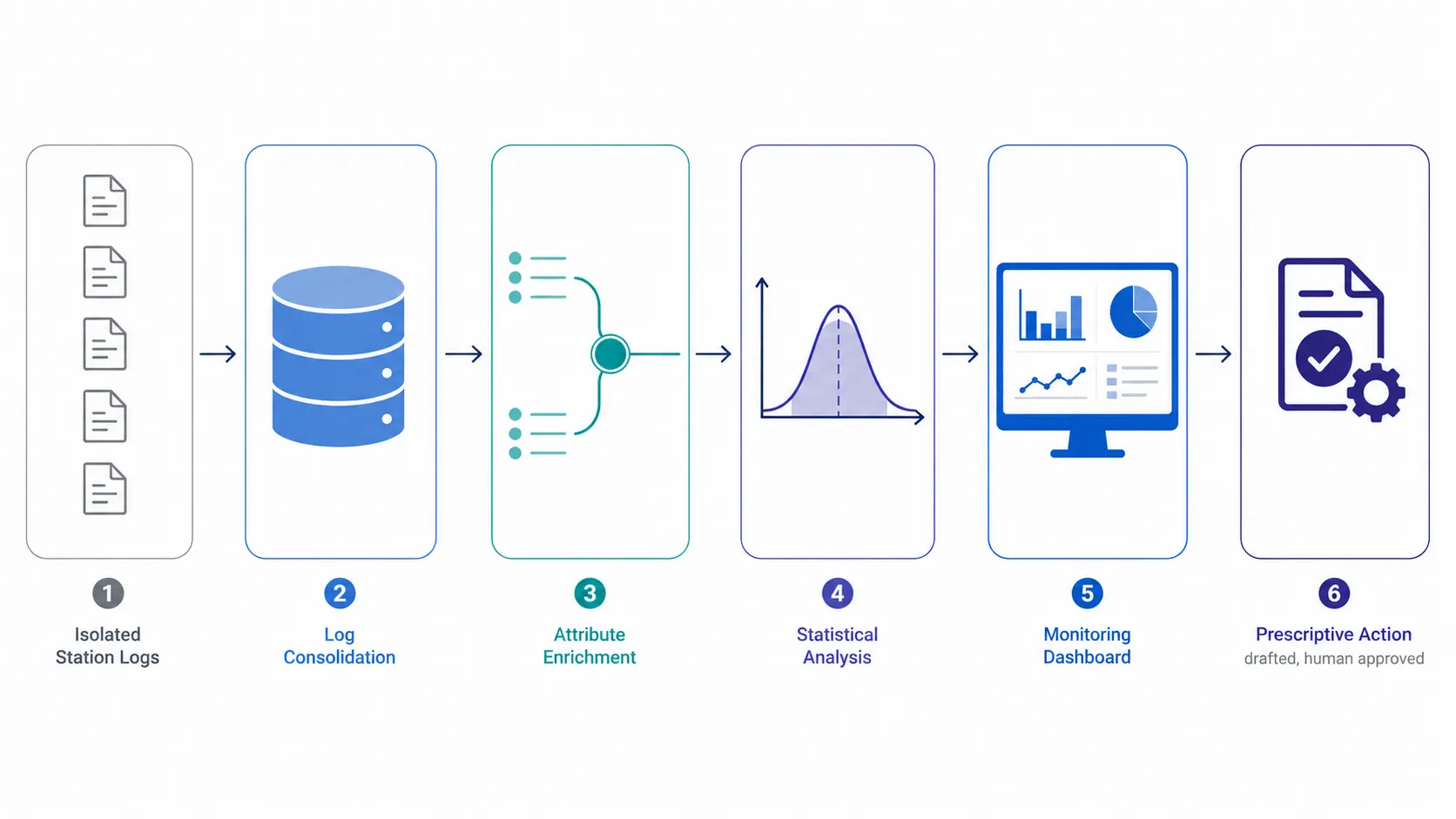
The work broke into six steps. Only one of them was clever, and it was not the one that took the longest.
Step 1: Consolidate the Siloed Measurement Logs
Each checking station wrote its own measurement log. The logs existed, were retained, and were complete. They were also separate, which meant that in practice nobody ever looked at two of them side by side.
We consolidated the per-station logs into a single dataset in SQL, one row per measured unit. This step was unglamorous and necessary. As long as the data lived in per-station silos, the per-station comparison was impossible to make, which is precisely why the pattern had survived undetected.
Step 2: Tag Every Measurement With Both Machine IDs
The consolidated dataset carried unit ID, measured value, timestamp, and pass/fail flag. We joined it to production records so that every measurement also carried two things it had never carried together:
- the production machine ID that made the unit
- the checking machine ID that measured it
Those two fields are the entire analysis. Everything after this is reading what they show.
Step 3: Stratify the Scatter Plot by Machine
This is the step that found the problem, and it is a technique any quality engineer already knows.
We plotted the measured critical quality attribute for every unit, exactly the same data the aggregate view had been built on, and colored the points by checking machine ID.
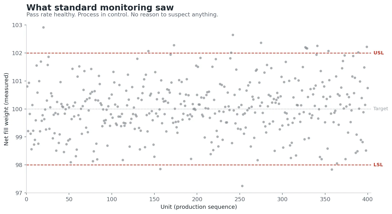
Plotted in a single color, the data looked healthy. Every point sat comfortably inside the spec window. This is the view the organization had been living with.
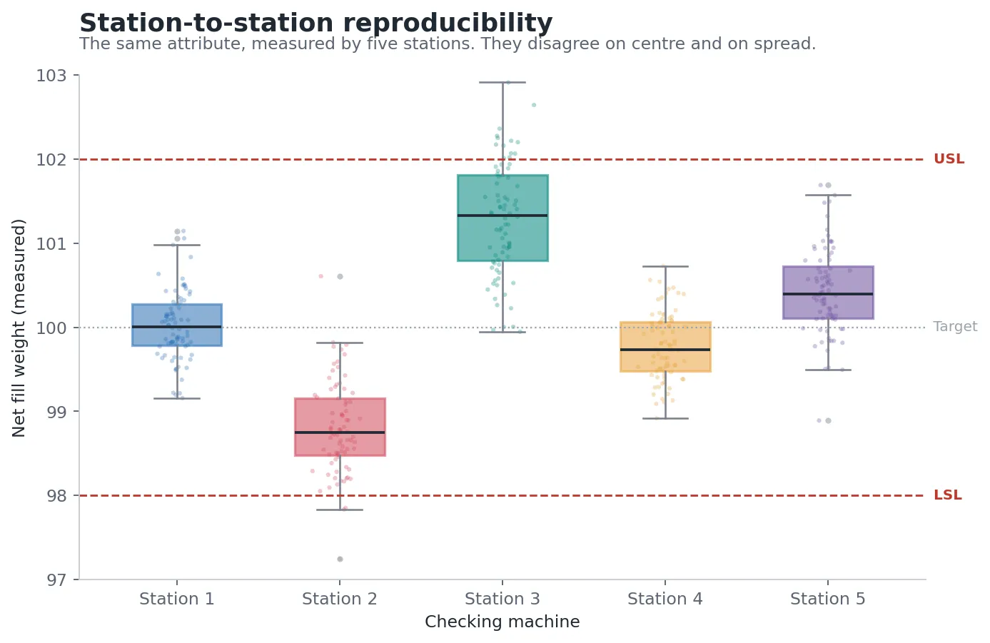
Colored by checking station, the same points separated into distinct clusters. Each station occupied its own band. Some bands sat near the center of the spec window, others crowded a limit, and the units measured by the offset stations straddled a spec boundary that the units themselves had nothing to do with.
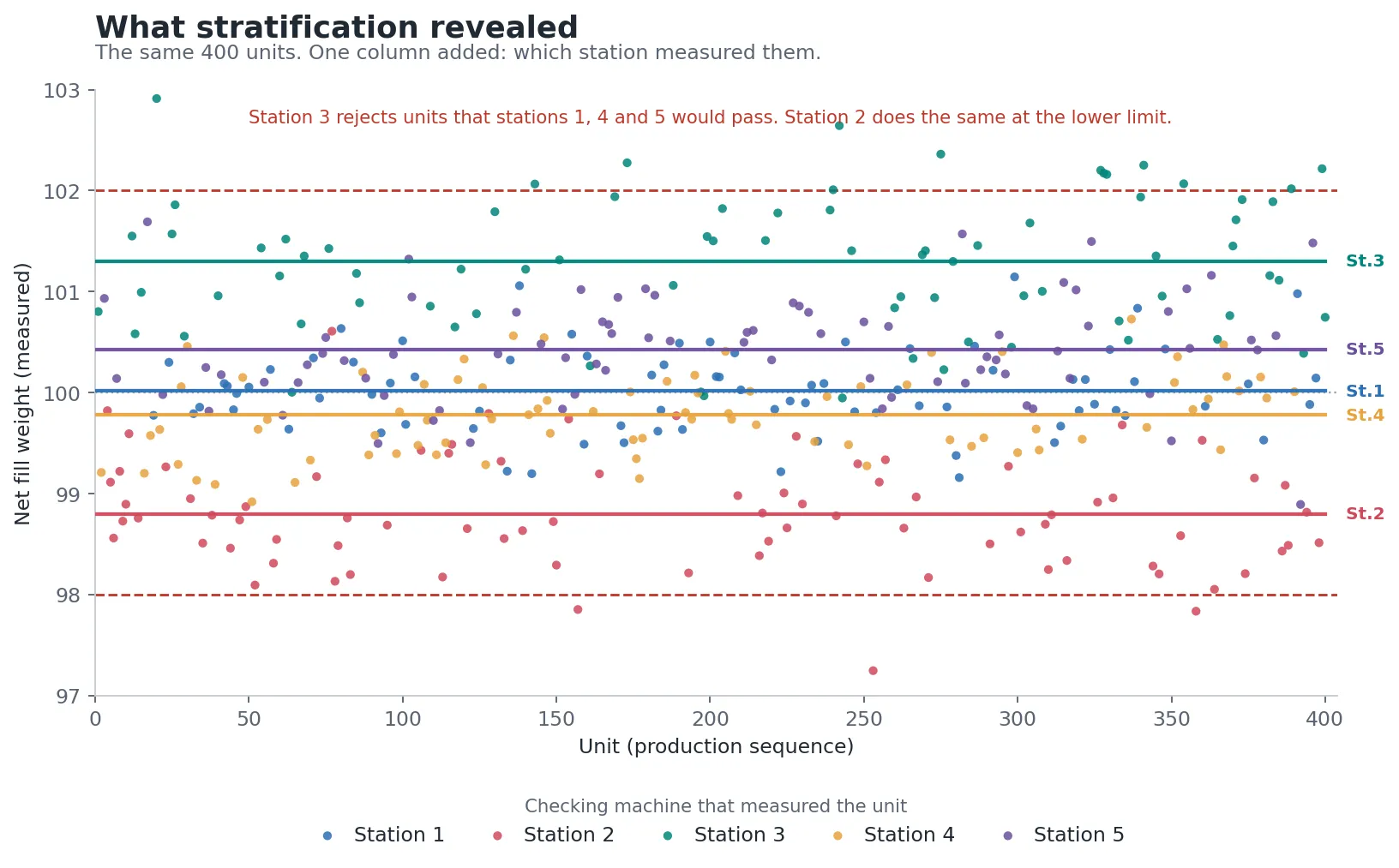
Same data. Same axes. One added dimension. The picture changed completely.
Split station by station, the offsets are unambiguous. Every station is measuring comparable units, and every station reports a different answer.
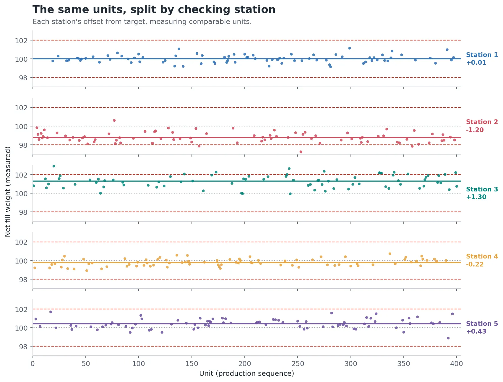
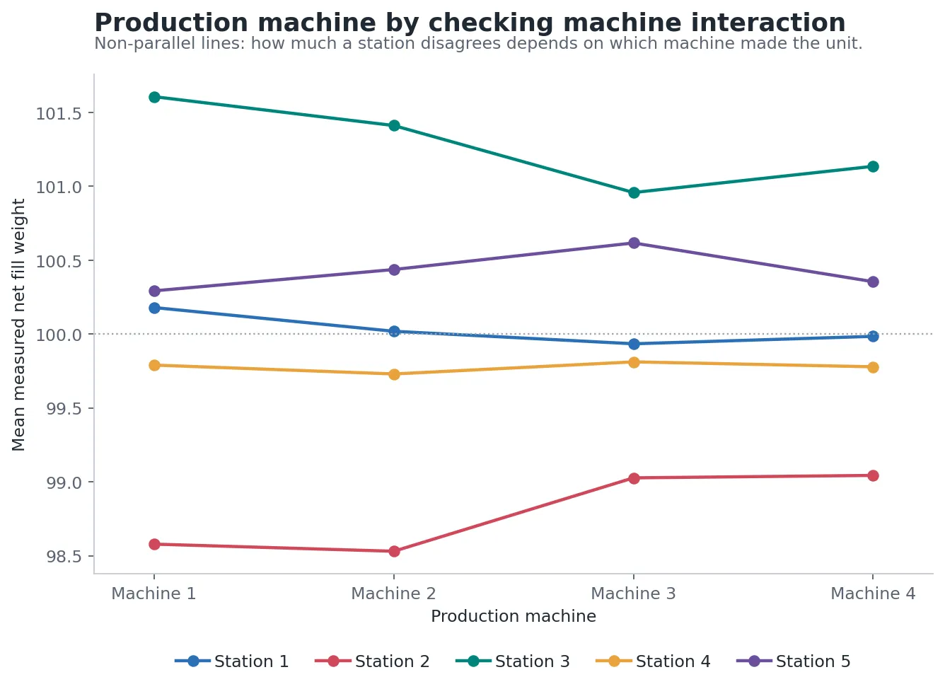
Cross-tabulating production machine against checking machine sharpened it further. The offsets were not a flat per-station bias that applied equally to everything. How much a station disagreed depended on which production unit had made the part it was measuring. The two factors interacted.
Step 4: Quantify It Properly
A scatter plot is enough to raise the alarm. It is not enough to act on in a regulated environment, and it is not enough to hand to a quality organization that has to defend a decision.
We ran an ANOVA-based variance components analysis in Python, in the structure of a Gage R&R study, to separate total observed variation into its sources:
- variation genuinely coming from the product
- reproducibility, the equipment-to-equipment component, the disagreement between checking stations measuring comparable units
- the production-machine by checking-machine interaction, the effect the stratified plot had already hinted at
That put a number on it. Instead of "the stations look different on this chart," the quality team had a quantified share of total observed variation attributable to the measurement system rather than to the product, expressed in the vocabulary their auditors, their MSAT group, and their own procedures already used.
In the illustrative dataset shown here, roughly 70 percent of the total observed variation traces to the checking station rather than to the product. That is the number that reframes the problem. Most of what the plant had been managing as process variation was not process variation at all.
Step 5: Make It Visible Permanently
A one-time study finds a problem once. Stations drift, get serviced, get replaced, and drift again.
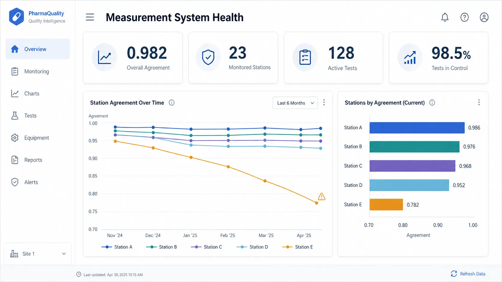
We built a measurement system health view in Power BI that tracks station agreement over time, so the comparison that took a special analysis to make the first time is now a standing view. When a station starts to separate from the others, it shows up while it is still a calibration task rather than after it has become a batch investigation.
Step 6: Answer "So What Should We Do About It?"
A dashboard that flags one station falling to 0.78 agreement with the others, while the rest hold above 0.95, has done its job. It has also stopped one step short of the only question that matters on the floor: what do we do now?
In practice that question was answered by a person. A quality engineer noticed the drift, then spent the rest of the morning reconstructing the consequences by hand. Which units did that station measure since the drift began? Where are those units now? Which of them sit close enough to a spec limit that the station's offset could have flipped the verdict? Did any of them already ship?
Every input to those questions was already in the consolidated dataset. Nobody had connected the alert to the answer.
So we added a reasoning layer on top of the monitoring view. When a station crosses a drift threshold, an agent works the case the way the engineer did, and it does it in the time it takes to read the alert:
- Scopes the exposure. Identifies the drift onset from the agreement trend, then pulls every unit that station measured after that point.
- Separates the borderline from the safe. Re-evaluates each measurement against the station's estimated offset and flags only the units where the correction would change the pass/fail outcome. This is the list that matters, and it is almost always a small fraction of the total.
- Follows the units downstream. Determines which affected lots are still on site, which are in quarantine, and which have already been released.
- Drafts the action. Produces a recommendation with the evidence attached: recalibrate the station, hold the specific lot numbers that carry borderline units, and open a deviation if released material is implicated.
The output is not "Station 5 disagrees with the others." It is closer to: Station 5 has drifted since May 18. It measured 1,248 units in that window. Of those, 156 sit close enough to a spec limit that the station's offset could have changed the verdict, spanning four lots. Two are still on site and two have shipped. Recommended: investigate the root cause at Station 5, increase monitoring on the affected lots, and review disposition for the borderline units.
That is the difference between an insight and an instruction.
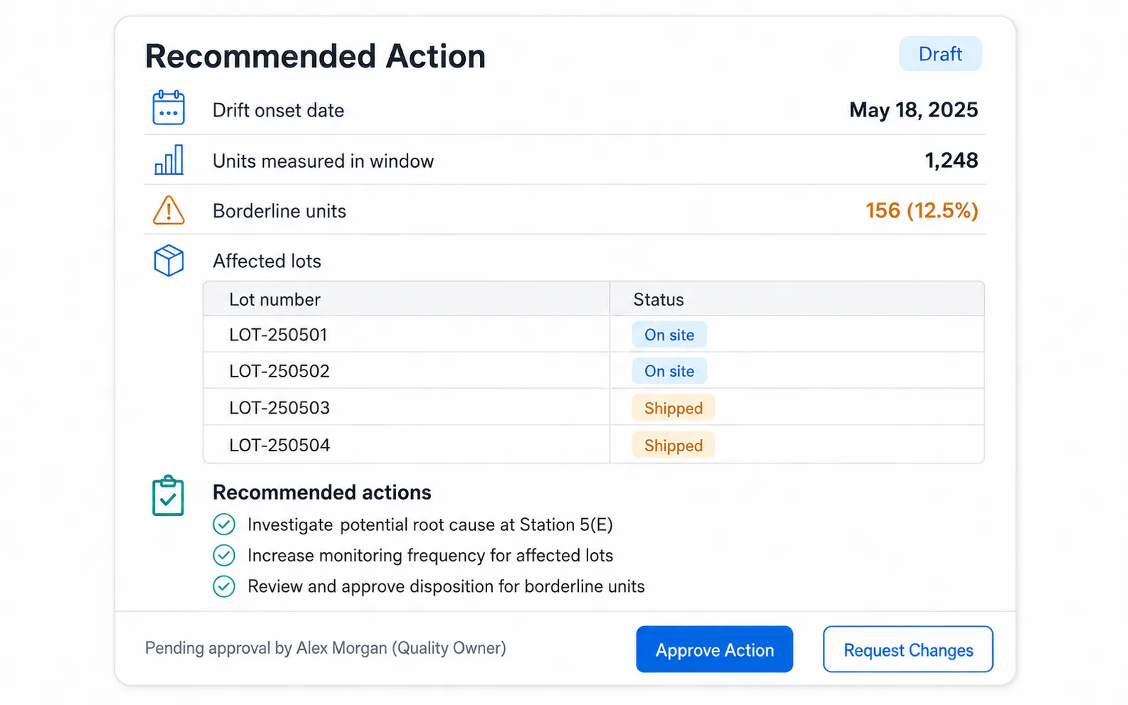
The agent does not act. It cannot recalibrate a station, place a hold, or open a deviation. It assembles the case and routes it to a named owner, who approves or rejects it, and that decision is logged. In a regulated environment this boundary is not caution for its own sake. Batch disposition has to be attributable to a person, and an autonomous system that quarantines stock on its own inference is not auditable. The same principle governs our AI order entry work: the agent investigates, the human and the rules decide.
What the reasoning layer removes is not the judgment. It is the two hours of evidence gathering that used to happen before anyone could exercise that judgment.
Business Impact
The reframe was the result. The variation the plant had been managing as a product problem was substantially a measurement problem.
That changes what you do next. Every corrective action aimed at the production process was aimed at the wrong target, and would have kept being aimed at the wrong target indefinitely, because the metric used to evaluate whether it worked carried the same distortion as the metric that triggered it.
What followed from the analysis:
- Station-to-station reproducibility was quantified, in the standard MSA framing, and became a tracked number instead of an untested assumption.
- Checking stations were recalibrated and standardized, so that a unit's pass/fail outcome stopped depending on routing.
- False rejections fell, recovering yield that had been scrapped for failing a station rather than failing the spec.
- False acceptances fell, which is the outcome that matters most in a regulated context and the hardest one to detect without this analysis.
- Capability metrics became meaningful, because Cpk stopped silently including equipment variation in what it reported as process variation.
- Drift is now caught early, through ongoing monitoring rather than through the investigation that follows an escape.
- Each drift event arrives as a drafted action, with the affected units, the borderline subset, and the downstream lot status already assembled, rather than as an alert that starts a manual investigation.
| Aggregate monitoring | Stratified analysis | With the prescriptive layer | |
|---|---|---|---|
| What it showed | Healthy pass rates, in-control charts | Distinct clusters by checking station | A drafted action with evidence attached |
| Measurement variation | Invisible, pooled into product variation | Quantified as a variance component | Translated into affected units and lots |
| Pass/fail reliability | Depends on which station measured the unit | Consistent across stations | Borderline units identified before release |
| Capability metrics | Inflated variation, misleading Cpk | Reflects actual process capability | Monitored continuously for drift |
| Corrective action | Aimed at the production process | Aimed at the measurement system | Specified, owned, and logged |
| Time from signal to decision | No signal | Analyst investigates | Evidence pre-assembled, human approves |
The Method: Stratify by the Equipment
The reusable technique here is worth stating on its own, because it is not specific to fill weight, to pharma, or to this plant.
Any critical measurement should be stratified by the equipment that produced the unit and the equipment that measured it. Aggregate SPC pools those sources together by construction. Pooling is what makes a control chart readable, and it is also what makes an equipment signature disappear into what looks like ordinary common-cause variation.
The conditions that make a plant vulnerable to this are common and easy to check for:
- more than one station measures the same critical attribute
- units are routed to stations by availability rather than by rule
- station logs are retained separately and never compared
- monitoring reports aggregate pass rates rather than per-station distributions
When those four are true, the analysis is worth running. The data required already exists, because the stations are already logging it. The barrier is almost never data availability. It is that nobody has joined the logs and added the one column that makes the pattern visible.
The second half of the method matters as much as the first. Finding the pattern once is a study. What makes it operational is closing the loop from signal to instruction: monitor the stations continuously, and when one drifts, assemble the consequences automatically so the quality owner receives a decision to approve rather than an investigation to start.
Why This Worked
The insight did not come from a sophisticated model. It came from adding one dimension to a plot the organization already had.
That is worth sitting with, because it runs against the instinct that a hidden problem needs an advanced method to find. The aggregate monitoring was not unsophisticated. It was correctly built, correctly maintained, and answering a slightly different question than the one that mattered. It asked whether the measured values were in control. It could not ask whether the measured values meant the same thing from station to station, because it had already averaged away the only variable that could answer that.
The analytical judgment was in knowing which variable to stratify by. The execution was a scatter plot.
The same judgment applies at the other end of the pipeline. A dashboard reports a condition. It does not tell anyone what to do, which units are exposed, or who owns the next move. Leaving that translation to whoever happens to read the alert is how a finding this expensive stays a finding. Automating the evidence gathering, while keeping the decision with a named human, is what turns a measurement study into a control.
Technologies and Tools
Python (pandas, statsmodels), ANOVA-based variance components analysis, Gage R&R / Measurement System Analysis, SQL, Power BI, LLM-based reasoning layer for prescriptive recommendations
Notes on This Case Study
This case study is a representative, anonymized account. The client is not identified, and the figures and visuals are illustrative rather than drawn from client data. The charts shown recreate the pattern that the analysis surfaced, using synthetic data built to demonstrate the effect.
The approach transfers directly across measured attributes. The critical quality attribute here is net fill weight, but the same analysis applies without structural change to tablet weight, content uniformity, fill volume for injectables, or dimensional and vision inspection measurements. The production machine and checking machine roles stay the same regardless of what is being measured.